Webchat Component
This section will describe how to embed and configure the Hubster Webchat component onto your website. Different configuration examples will be provided and a detail explanation describing each configuration property available.
Adding to Website
When working with Hubster’s Webchat component, you must first embed the component onto every webpage where web-chatting is desired on your website.
Below is a snippet of the default configuration to enable web-chatting on your webpage. It should be noted that it’s best to add the webchat component at the very tail end of the HTML webpage.
<!DOCTYPE html>
<html  lang="en">
<head>
    ...
</head>
<body>
    ...

    <!-- Webchat script -->
    <hubster-webchat></hubster-webchat>
    <script>
    window.HUBSTER_CONFIG = {
        // remove these lines when deploying to production
        engineEndpoint: 'https://demo-engine.hubster.io',
        eventsEndpoint: 'https://demo-events.hubster.io',
        integrationId: 'B205B3EC-A9D7-4243-B88C-017533957DBE',
        sessionTTL: 43200
    };
    </script>
    <script src="https://hubsterdevcdn.azureedge.net/pub/scripts/webchat/hubster-webchat-1.0.min.js"></script>
</body>
</html>
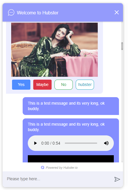
By default, the webchat component will look like this:
Configuring the look-and-feel
Although, Hubster loves the default look, we realize our customers need the ability to change how the webchat component looks-and-feels on their website. A lot of consideration and flexible has been provided, giving customers a wide range of style settings to configure their webchat component.
Below is an example configuration on how one would style the component using a blue theme.
<!DOCTYPE html>
<html  lang="en">
<head>
    ...
</head>
<body>
    ...

    <!-- Webchat script -->
    <hubster-webchat></hubster-webchat>
    <script>
    window.HUBSTER_CONFIG = {
        // remove these lines when deploying to production
        engineEndpoint: 'https://demo-engine.hubster.io',
        eventsEndpoint: 'https://demo-events.hubster.io',
        integrationId: 'B205B3EC-A9D7-4243-B88C-017533957DBE',
        sessionTTL: 43200,
        styling: false,
        styles: {
            header: {
                title: 'My Company Title',
                iconUrl: 'https://hubsterdevcdn.azureedge.net/pub/demo/webchat/rcm/chat_logo.png',
                style: {
                    'backgroundColor': '#004F99'
                }
            },
            mount: {
                style: {
                    'backgroundColor': '#004F99',
                    'bottom': '5rem',
                    'right': '.9rem',
                    'z-index': '100'
                },
            },
            userTextMessage: {
                'backgroundColor': '#3566BF'
            },
            agentTextMessage: {
                'color': '#22186e',
                'backgroundColor': '#ECECEC'
            },
            botTextMessage: {
                'color': '#22186e',
                'backgroundColor': '#ECECEC'
            },
            footer: {
                maxInputHeight: '40px'
            }
        },
        onMount(mounted) {
            console.log('Mounted:' + mounted);
        },
        mountOnLoad() {
            return -1;
        },
        onReceivedActivity(activity) {
            console.log(activity);
        },
        onConversation() {
            return {
                "bindingKey": "some_unique_userId",
                "properties": {
                    "profile": {
                        "full name": "SomeUserName",
                        "gender": "female",
                        "custom1": "value1",
                        "custom2": "value2",
                        ...
                    },
                    "additional": {
                        "custom1": "value1",
                        "custom2": "value2",
                        ...
                    }
                }
            };
        }
    };
    </script>
    <script src="https://hubsterdevcdn.azureedge.net/pub/scripts/webchat/hubster-webchat-1.0.min.js"></script>
</body>
</html>
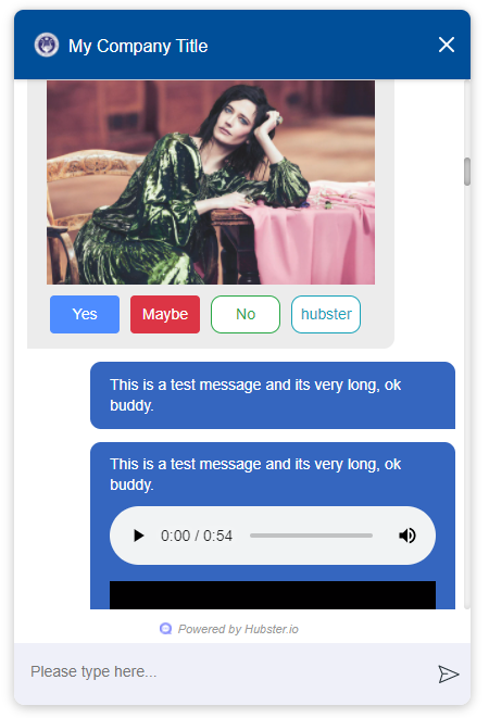
The above configuration yields the following theme.
Note
Before going live, it’s best to style the webchat component first to suite your site’s look-and-feel. This however, can be a time consuming task, but luckily Hubster makes this easy.
Hubster provides configuration property called styling (see the example above). By default, this property is set to false. However, by setting this property to true, Hubster will provide a list of all the available webchat widgets for you to style. Most widgets share the same styling property, meaning that, if you change one style, it may affect one or more other widgets.
Hubster provides a wide range of styles that can be change, however, try to avoid changing styles that may affect sizes and position as we may not guarantee the visual behavior.
Furthermore, when styling is set to true, the webchat component disables all backend communications with Hubster services.
Configuration
| Property | Mandatory | Comments |
|---|---|---|
| engineEndpoint | No | When developing in demo mode, set this value to
The default is: https://engine.hubster.io (production)
|
| eventsEndpoint | No | When developing in demo mode, set this value to:
The default is: https://events.hubster.io (production)
|
| sessionTTL | No | How long the user’s conversation should last in mins. The user’s conversion is maintain even after they close their browser. If the user does not visit the site after the sessionTLL has expired, a new conversation will be established. Sessions are based on a rolling window, meaning that the session’s start time will reset if the user revisits the site prior to the session expiring. The default is 1440 (1 day). |
| integrationId | Yes | The integration id for this Webchat integration. |
| openOnNewMessage | No | This tells the webchat component when closed, to open the chat window if a new message immediately arrives. The default is false. |
| hideCloseIcon | No | Don’t show the header’s close Icon. The default is false. Note: If the hideCloseIcon property is set to true, then there is no way to close the webchat window. |
| fullWindow | No | If set to to true, the webchat window will open in full window mode. |
| styling | No | Set this value to true when styling the webchat component. The webchat will provide a list of all the available webchat widgets for you to style. The default is false. |
| styles | No | A collection of styles. See the Styles Configuration section. |
| mountOnLoad | No | A JavaScript method that will be invoked when the webchat component is first loaded on the host webpage. This method when provided, allows the developer to determine how long of a delay (in milliseconds) the webchat component should wait before mounting (open). On page reload
– a return value < 0 indicates no mounting should occur
– a return value >= 0 indicates mount after number of milliseconds
mountOnLoad(): number; |
| onMount | No | A JavaScript method that will be invoked when the webchat component has been mounted (open) or docked (closed). onMount(mounted: boolean): void;
|
| onReceivedActivity | No | A JavaScript method that will be invoked when the webchat component receives an activity from the Hubster Engine service before it’s displayed on the webchat list. onReceivedActivity(activity: Activity): void;
|
| onBeforeActivitySend | No | A JavaScript method that will be invoked when the webchat component is about to send a user activity to Hubster’s Engine service. The programer has the option to inspect the activity and perform any action as deemed necessary. Return true to allow the user activity to be sent, otherwise false to ignore it.
onBeforeActivitySend(activity: Activity): boolean;
Note Typically this event is used when the user presses a postback button event. The payload of the postback may contain a special action that programer can then inspect and preform a local action on the browser. |
| onConversation | No | A JavaScript method that will be invoked when the webchat component is about to establish a conversation. The developer has the option to provide a unique binding key (typically a user id) and other properties, such as the user’s name, etc. onConversation(): EstablishConversation;
{
    "bindingKey": "some_unique_userId",
    "properties": {
        "profile": {
            "full name": "SomeUserName",
            "gender": "female",
            "prop1": "value1",
            "prop2": "value2"
        },
        "additional": {
            "prop1": "value1",
            "prop2": "value2"
        }
    }
}
Note Typically this method is used if the web app hosting the webchat component, knows some thing about the logged user. The web app can provide a unique value for the bindingKey, typically the user Id and at minimum, provide the user’s name in the properties.profile.”full name” property.
|
Styles Configuration
Hubster wanted to provide an easy, consistent and standard way styling your webchat component. Hubster decided to adhered to the HTML style property format as shown below.
<div styles='color: red; background-color: yellow'>...</div>
The only stipulation is that any style property that is normally hyphenated, will be replace with its camelCase equivalent:
- text-decoration will be represented as ‘textDecoration’
- z-index will be represented as ‘zIndex’
- background-color will be represented as ‘backgroundColor’
- color will be represented as ‘color’ (in this example, the property name remains the same)
- and so on…
See a more formal example below.
window.HUBSTER_CONFIG = {
    styles: {
        mount: {
            iconUrl: 'https://cdn.com/logo.png',
            style: {
                'backgroundColor': '#004F99',
                'bottom': '5rem',
                'right': '.9rem',
                'zIndex': '100'
            },
        },
        userTextMessage: {
            'backgroundColor': '#3566BF'
        },
    },
    ...
};
Note
Values for each style property must be incased in single ‘quotes’. This is true even for properties that accept numeric values. If values are not provided, the webchat component will assume its defaults.
| Style | Comments |
|---|---|
| chatBackgroundColor | This style controls the background color for the webchat list view. Examples: ‘#ABDCEF’ or ‘red’ … |
| userTextMessage | This style controls the user text message bubble. See example below:
window.HUBSTER_CONFIG = {
   styles: {
       userTextMessage: {
           'color': 'green'
           'backgroundColor': '#CFCFCF'
       },
   },
   ...
};
|
| agentTextMessage | This style controls the agent text message bubble. See example below:
window.HUBSTER_CONFIG = {
   styles: {
       agentTextMessage: {
           'color': 'blue'
           'backgroundColor': 'white'
       },
   },
   ...
};
|
| botTextMessage | This style controls the bot text message bubble. See example below:
window.HUBSTER_CONFIG = {
   styles: {
       botTextMessage: {
           'color': 'yellow'
           'backgroundColor': '#00FF00'
       },
   },
   ...
};
|
| header | This style controls the header of the webchat component. See example below:
window.HUBSTER_CONFIG = {
    styles: {
        header: {
            title: 'My Company Title',
            iconUrl: 'https://cdn.com/logo.png',
            style: {
                'color': 'white'
                'backgroundColor': 'blue'
            }
        }
    },
    ...
};
|
| footer | This style controls the footer of the webchat component. See example below:
window.HUBSTER_CONFIG = {
    styles: {
        footer: {
            maxInputHeight: '40px',
            placeholderText: 'My text input placeholder...'
        }
    },
    ...
};
|
| mount | This style controls the mount of the webchat component. See example below:
window.HUBSTER_CONFIG = {
    styles: {
        mount: {
            iconUrl: 'https://cdn.com/logo.png',
            style: {
                'backgroundColor': '#004F99',
                'bottom': '5rem',
                'right': '.9rem',
                'z-index': '100'
            }
        }
    },
    ...
};
|
| buttons | Hubster supports the following Postback buttons. 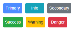
To change the look-and-feel, see the following configuration.
window.HUBSTER_CONFIG = {
    styles: {
        buttons: {
            primary: {
                'color': '#004F99',
                'backgroundColor': '#004F99',
                'borderColor': 'black'
            },
            primaryHover: {
                'color': 'white',
                'backgroundColor': 'green',
                'borderColor': 'yellow'
            },
            info: {
                'color': '#004F99',
                'backgroundColor': '#004F99',
                'borderColor': 'black'
            },
            infoHover: {
                'color': 'white',
                'backgroundColor': 'green',
                'borderColor': 'yellow'
            },
            // see above properties for examples
            secondary: { ... },
            secondaryHover: { ... },
            success: { ... },
            successHover: { ... },
            warning: { ... },
            warningHover: { ... },
            danger: { ... },
            dangerHover: { ... },
        }
    },
    ...
};
|
| quickReplies | Hubster supports the following Quick Reply buttons. 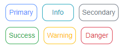
To change the look-and-feel, see the following configuration.
window.HUBSTER_CONFIG = {
    styles: {
        quickReplies: {
            primary: {
                'color': '#004F99',
                'backgroundColor': '#004F99',
                'borderColor': 'black'
            },
            primaryHover: {
                'color': 'white',
                'backgroundColor': 'green',
                'borderColor': 'yellow'
            },
            info: {
                'color': '#004F99',
                'backgroundColor': '#004F99',
                'borderColor': 'black'
            },
            infoHover: {
                'color': 'white',
                'backgroundColor': 'green',
                'borderColor': 'yellow'
            },
            // see above properties for examples
            secondary: { ... },
            secondaryHover: { ... },
            success: { ... },
            successHover: { ... },
            warning: { ... },
            warningHover: { ... },
            danger: { ... },
            dangerHover: { ... },
        }
    },
    ...
};
|
| links | Hubster supports the following Link buttons. 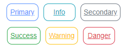
To change the look-and-feel, see the following configuration.
window.HUBSTER_CONFIG = {
    styles: {
        links: {
            primary: {
                'color': '#004F99',
                'backgroundColor': '#004F99',
                'borderColor': 'black',
                'textDecoration': 'none'
            },
            primaryHover: {
                'color': 'white',
                'backgroundColor': 'green',
                'borderColor': 'yellow',
                'textDecoration': 'underline'
            },
            info: {
                'color': '#004F99',
                'backgroundColor': '#004F99',
                'borderColor': 'black',
                'textDecoration': 'none'
            },
            infoHover: {
                'color': 'white',
                'backgroundColor': 'green',
                'borderColor': 'yellow'
                'textDecoration': 'underline'
            },
            // see above properties for examples
            secondary: { ... },
            secondaryHover: { ... },
            success: { ... },
            successHover: { ... },
            warning: { ... },
            warningHover: { ... },
            danger: { ... },
            dangerHover: { ... },
        }
    },
    ...
};
|
| listItemButtons | Hubster supports the following List Item buttons. See buttons outlined in red. 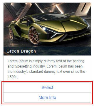
To change the look-and-feel, see the following configuration.
window.HUBSTER_CONFIG = {
    styles: {
        listItemButtons: {
            primary: {
                'color': '#004F99',
                'backgroundColor': '#004F99',
                'borderColor': 'black',
                'textDecoration': 'none'
            },
            primaryHover: {
                'color': 'white',
                'backgroundColor': 'green',
                'borderColor': 'yellow',
                'textDecoration': 'underline'
            },
            info: {
                'color': '#004F99',
                'backgroundColor': '#004F99',
                'borderColor': 'black',
                'textDecoration': 'none'
            },
            infoHover: {
                'color': 'white',
                'backgroundColor': 'green',
                'borderColor': 'yellow'
                'textDecoration': 'underline'
            },
            // see above properties for examples
            secondary: { ... },
            secondaryHover: { ... },
            success: { ... },
            successHover: { ... },
            warning: { ... },
            warningHover: { ... },
            danger: { ... },
            dangerHover: { ... },
        }
    },
    ...
};
|
| listButtons | Hubster supports the following List buttons. See buttons outlined in red. 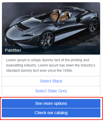
To change the look-and-feel, see the following configuration.
window.HUBSTER_CONFIG = {
    styles: {
        listButtons: {
            primary: {
                'color': '#004F99',
                'backgroundColor': '#004F99',
                'borderColor': 'black',
                'textDecoration': 'none'
            },
            primaryHover: {
                'color': 'white',
                'backgroundColor': 'green',
                'borderColor': 'yellow',
                'textDecoration': 'underline'
            },
            info: {
                'color': '#004F99',
                'backgroundColor': '#004F99',
                'borderColor': 'black',
                'textDecoration': 'none'
            },
            infoHover: {
                'color': 'white',
                'backgroundColor': 'green',
                'borderColor': 'yellow'
                'textDecoration': 'underline'
            },
            // see above properties for examples
            secondary: { ... },
            secondaryHover: { ... },
            success: { ... },
            successHover: { ... },
            warning: { ... },
            warningHover: { ... },
            danger: { ... },
            dangerHover: { ... },
        }
    },
    ...
};
|
Webchat Script Versions
| Version | Reference |
|---|---|
| 1.0 | https://hubsterdevcdn.azureedge.net/pub/scripts/webchat/hubster-webchat-1.0.min.js |